07.05.2019
Purple color and its shades
Violet Violetta
Didn't wait for summer.
She woke up early
And it started to bloom.
Her funny hedgehog
I noticed among the grass
And wanted Violet
Bring water.
"Violet Violetta,
Drink this water.
She's a little more transparent.
Than your petals!
Not enough in the forest
Both brightness and color!
Poppies will wake up later
daisies, cornflowers.
Violet Violetta
Sent hello to everyone.
Their kids and adults
Carried happy Hedgehog.
And if you search
Items-"violet"
(violet,
lilac,
lavender,
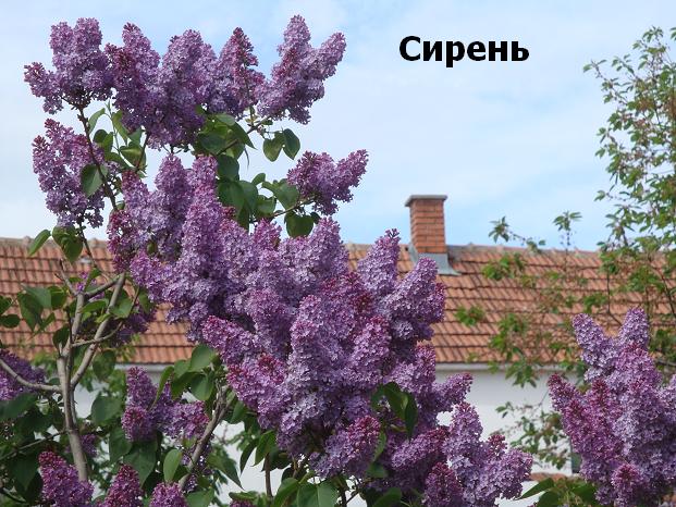
plum, lilac
and magenta)
it's like a violet
find hello!
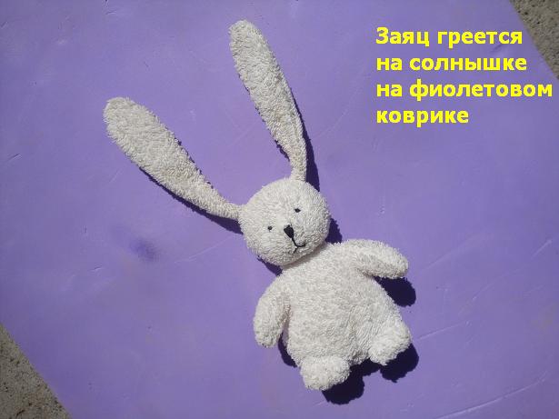
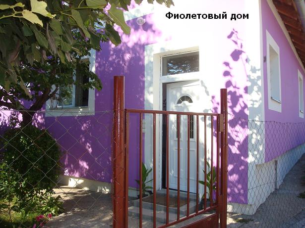
Well, are there violet objects around with greetings from Violetta?
By the way, maybe we can add a tongue-twisting couplet to the story?
Please!
Yes, as if from a lovely
Violets Violets-
Viola Violetta-
violets Violetta-
Hello you will find!
It’s not in vain for a cute violet beautiful name. See how the word "violet" is translated into other languages:
violet (English, French), viola (Italian), violett (German), violeta (Spanish), fiolett (Norwegian), fioletowy (Polish), violetti (Finnish), violetinis (Lithuanian), violets (Bulgarian).
![]()
Its color is very pleasant, and shades of purple- a great many.
- By the way: about my book of poems for children
pure purple color can be obtained by mixing red and blue paints in equal proportions. Therefore, we even called purple a shade of blue in. To the same extent it can be called a shade. And to be precise, purple is considered an intermediate color - between red and blue. Let's add more blue - there will be cold shades. Let's add more red - warm.
But in order to more accurately deal with the shades of purple, I had to make a kind of home-made household scale out of 4 color cards Shades of purple . Who will find a link to a more complete and correct card with color names - please share in the comments! So,
Scale

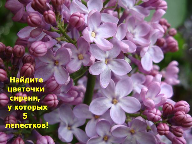
Well, let's see greetings from Viola Violetta? You mean Violets Violets? That is, let's look at the purple color around us?


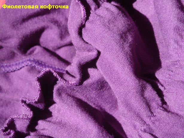
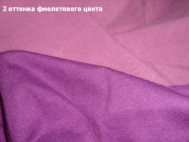
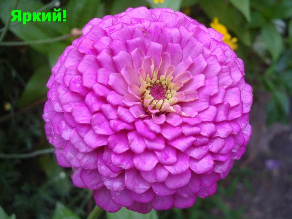


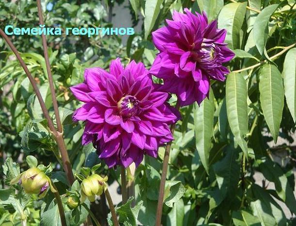


WITH purple perhaps the most diverse myths are connected in the interior. Many people love this color, but do not dare to introduce it into the interior.
In order to solve this question for myself once and for all, I propose to start by learning more about this color: what visual effects does it give, what kind of psychological mood, in which rooms it is better not to use it, what colors does it combine with, what shades does it come in?
In nature, purple is extremely rare - only in the petals of some flowers, mollusk pigments and in precious stones. Can an interior designer be more generous than nature in using this color?

general characteristics purple:
Distance is far.
Volume - reducing, making more elegant.
Mass is heavy.
Saturation - saturated.
Temperature is cold.
Lightness or brightness - darkened.
Movement is calm.
The first sensation is frightening, important, significant.
Psychological impact - veiled excitement, agitated and melancholy mood, mystery, awakens creativity and intuition, spurs the imagination, but does not contribute to rational thinking, calms, relieves irritation, improves sleep. In large quantities, it is tiring and depressing.
Lovers - sentimental or artistic and creative people, women.
Suitable rooms are bedroom, boudoir, meditation rooms, home theaters.
Unsuitable rooms - an office, children's rooms.
The secondary color is lemon yellow.
Preferred styles - futurism, hi-tech, pop art, Victorian style, modern.
Violet - the last of the six colors of the spectrum, is also the darkest. It is formed by mixing two main ones - hot red and ice blue. For this reason, he is quite complicated - after all, he has to reconcile the contradictions of these two colors that are completely different in psychological characteristics - calm and violent. It turns out well: the purple color is noble and elegant, but its use for the interior is complicated by the fact that at the same time it is a little gloomy, as well as mysterious and mysterious.


In any description of the features of the purple color, one can read that from ancient times, royal purple was used in the clothes of people of imperial blood - because the dye was so expensive that only monarchs could afford it. In modern times, representatives of catholic church. The mention of shade can also be found in various mystical and esoteric works. Thus, from the history of violet over the centuries, one can draw following characteristics- a small dosage of the use of this color, its luxury, as well as its peculiar relationship with the human soul.


Regarding the pure purple color, designers give the following advice: it is better to use it as an accent, an accessory. You don't have to cover the entire wall. The reasons are clear - firstly, it is so dark that such a wall will seem too gloomy. Secondly, it has the typical feature of a good luxury item - it is much more beautiful in small sizes, when properly presented and against a neutral background, than if it is used everywhere with vulgar generosity in colossal sizes (remember, gold leaf or crystal has the same features - if there are too many of them, they seem intrusive and tacky). So is purple - if an overdose occurs, the interior will seem unnatural and pretentious.


That is why a single sofa covered in purple morocco can turn a simple room with boring white walls into the most elegant salon - such a purple color is strong enough (it inherited this power from red) to become a color chord that draws all attention to itself. Furniture upholstery, pillows, curtains and carpets - this is the place in purple. If you still want to paint the entire plane of the wall, you should think about whether it is better to choose light, light shades of this color - lilac, purple, etc.?


A very non-standard solution - a purple ceiling! 


But what does purple do with the human psyche? Scientists believe that of all the components of the spectrum, it is the deepest and most complex. This color is characterized by veiled excitement, its mood is dreary, but at the same time excited. He is mysterious and prone to mysticism. Classic purple is said to be the color of the artistic, as it also evokes creativity and intuition while spurring the imagination. But don't expect him to help you decide. logical tasks(as opposed to orange): purple is suitable for a musician's office, but math will get in the way. In general, in large quantities, purple is simply annoying and depressing, although in the right dose it calms, relieves depression and improves sleep (this applies mainly to its light tones).


But still a lot depends on the shades. Light colors, favored by women, evoke romantic and nostalgic feelings. A man in a room made in a similar range will live a little uncomfortable - everything around will be too gentle, almost pink. Dark tones are more extravagant and harsh. They are not suitable for children, where lilac or lilac would be quite appropriate; they will not be useful in kitchens either - except perhaps as a small color spot. Another feature of the purple color: depending on what color it is paired with, purple can seem either warm or cold.


Good purple color combinations:
Monochrome range: a combination of purple with its paler shades, blue, blue, pink.
Contrasting gamma: combination with red, orange, as well as with its additional color - yellow.
Neutral gamma: combination with brown, ocher, green, gray and white. Pairing purple with black should be done with care.
Of all these combinations, the purple + white pair, which has already been discussed above, turns out to be the most elegant. It is enriched if, in addition to purple, its paler and pinkish shades are used.

When using red, care must be taken to ensure that these are tones that tend to be manganese red, and not hot, close to orange. Violet is also good in combination with blue and blue.
If red is closer to orange, we are talking about about a completely different range of interior. This combination, unlike the previous one, is dangerous and dramatic, and not everyone can withstand it. Active psychological pressure comes to the fore here, which red can create, and purple in this case looks like a gloomy color on the sidelines. It's wiser to stick with softer, lighter shades of red.

A more successful combination of purple with additional yellow. However, you should not take a lemon shade - it will look too sharp. With deep purple, soft, creamy yellow tones are recommended. If you chose lilac or purple, sand or mustard shades of yellow will help you.


Finally, it is very good to combine purple with green - think about the thickets of irises by the pond or the meadows of violets: it is difficult to find anything unpleasant to the eye in such a coloristic combination. In this case, it is also important to observe the measure in the intensity of colors - too deep purple and green tones will look gloomy and heavy.


The combination of purple with another common natural dye, brown, looks good. In this case, you can use both natural wood and stone, and painted surfaces.


Shades of purple:
Lavender
Lilac
purple
Purple
Plum
Eggplant
Amethyst
blackberry
Bilberry


Choosing the right style for a purple interior is not so easy - this color appeared in world art quite late and did not enter the area of Great Styles. Is that the Victorian era, as well as modernity, are able to offer their own options for its use.
But there is a much richer choice among the styles of the twentieth century: purple is successfully used wherever the idea of neon can be applied. This is futurism, hi-tech, pop art - in the latter they like to combine it with pink and yellow. It turns out a little harsh and, perhaps, not always convenient for living quarters. But public interiors come out very spectacular.


From powerful, compelling blue-violet hues to passionate red-violet, purple is the trickiest color of the rainbow. The people who prefer it are also the same: mystics, artists, designers, artists - in a word, extraordinary people who have one common quality - nonconformism (or a claim to it).
Creative and eccentric people have a passion for this color because of its uniqueness and extraordinary. Leonardo da Vinci wrote that his ability to focus and think is greatly enhanced with purple. Wagner composed his great works in a room with purple curtains. On the other hand, many have a negative attitude towards the color purple. Oswald Spengler, the German idealist philosopher, wrote in his famous book The Decline of Europe: “Violet is red seduced by blue, it is the color of a woman who is no longer able to give life, and the color of priests who have taken a vow of celibacy.”


Purple and its shades are the most mysterious and complex colors of the spectrum. Violet simultaneously combines the passion and assertiveness of red, plus calmness and depth. of blue color. At the same time, purple is the darkest of the pure chromatic colors, and its lightened shades can be so far removed from their “parent” that they will create contrasting combinations when paired with it.
By their own physical properties Violet has the longest wavelength in the visible spectrum. Maybe that's why mystics and esotericists consider purple to be a symbol of higher spiritual enlightenment. In the ancient teachings of Kabbalah, purple was considered a lush and magnificent color of leadership. The rabbis saw purple as a fusion of gray with purple, in their opinion, this color expressed humility, reverence and spiritual initiation.
Violet color is additional (complimentary) to yellow - the color of knowledge. And as the opposite of yellow, purple is the color of the unconscious and mysterious. On large areas pure purple can become menacing. Johannes Itten, an artist and Bauhaus teacher, wrote in his book The Art of Color that catastrophes lurking in it seem to break out of dark purple. But as soon as it is clarified, when light and knowledge illuminate the harsh piety of violet, then we begin to admire its beautiful gentle tones.


According to color therapists, violet light can effectively treat coughs, get rid of hoarseness, lower blood pressure, and even eliminate sleepwalking.


In combination with bright and fresh colors, purple makes the interior very juicy. If you combine purple only with white, then it also turns out beautiful and stylish. The combination of purple and white makes the whole picture contrast and slim.
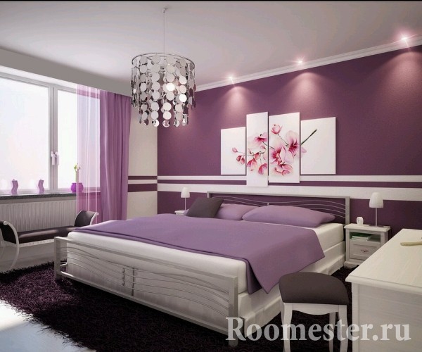
Please note that if you have only two basic colors in the interior - purple and white - then the colors of all accessories should not match tone-on-tone, but differ from each other, as in the photo on the right - the darkest purple is on the floor in this interior , on the curtains is the lightest, and the color of the walls and the decor of the bed differs in shades.
Pay attention to the nature of your purple color, that is, to which interior palette it belongs.
Deep purple combined with white is often used in interiors with strong classical motifs, as in the photo on the right. Gold, silver, crystal will go well with it.


The purple self-leveling floor is also a very non-standard and, of course, a beautiful solution. 


We all know that in any image, first of all, special attention is paid to the color scheme. Her the right combination not only in the elements of clothing, but also with the color type of a person - the most important component of your style. We advise all fashionistas to turn to shades of lilac. Purple stays in the top ten trendy colors in the autumn-winter season. Everything about the shades of lilac, purple, lavender, fuchsia and lilac will tell today
The color of your image is the most important part of it.
About purple and its shades
Violet is the most mysterious and mysterious color of the color spectrum.
Lilac - a soft shade of purple, formed by mixing red and blue flowers, the standard of which is the color of the lilac inflorescence. Piercing, mystical and strong, lilac "sounds" a little sad, but rest assured, very sophisticated!
There are quite a lot of shades in the lilac-violet range and each of them creates a unique image of the woman who wears it. It is important to choose the right shade of purple for you.
The trend of the coming season will be Persian indigo and deep purple hues.
Pink shades are also popular. They add color and beauty to the color scheme. The pink-purple hue somehow stands out in a special way among other tones in pastel colors. It is delicate, elegant and not too catchy.
Light lilac color will help emphasize a romantic and feminine look. The undoubted highlight of the new season are products with inserts made of transparent materials.
In combination with lilac shades, translucent details of clothing will create an airy, light and relaxed look.
Who suits shades of purple
If you are one of the women with copper, reddish, chestnut hair, greenish, gray-green or hazel eyes, and freckles on your skin, then purple will suit you: shades of ripe plum, purple-red, lilac-red, red grape color.
If you are a bright brunette with brown eyes, then settle for thick shades: inky, blueberry, indigo and pure, bright purple.
If you have a delicate natural color, blond, light blond hair, pale skin, gray, gray-blue or gray-green eyes, then you will suit: shades of lavender, transparent lilac, violet, light gray-violet.
What to combine shades of purple
Gamma purple goes well with shades of green: jade, emerald, light green, khaki, marsh. In this case, the image is refined, ambiguous, complex.
In combination with shades of gold, copper, the bow will turn out to be truly luxurious, rich and memorable.
Violet-lilac next to the shades of yellow-orange seem brighter and more intense.
In combination with the color powder, transparent gray or beige, purple looks soft and restrained.
Violet is a complex color, people who are indifferent to it do not exist - they either love it or not. Many refuse it because they find it too gloomy, shrouded in myths, negative connotations. Even those who are very impressed with him are afraid to introduce purple into the interior of their home. In vain! Correct use numerous incredible shades will help bring elegance, elegance and style to the design, will give you comfort and amaze the imagination of your guests.
Psychologists and color therapists have long formed an opinion about purple. Opponents lack openness, sincerity of character. Lovers are distinguished by calmness, inner strength. Coloring cannot be called boring, banal, because it is obtained by mixing two: red and blue, which are opposite in spectral analysis. The share of inconsistency can manifest itself in the character of a person who gravitates towards purple, but in addition, he is characterized by harmony, the desire to achieve peace of mind.
Purple and mustard color combination
It has been proven that this color helps to develop creativity, imagination, intuition, to acquire a balance of spiritual and physical energy. Subconsciously, creative, artistic personalities gravitate, but not devoid of sentimentality and sensitivity. Using it, you will get a room that promotes calm, problem solving, improves mood. As for the fashionable component, choosing purple in the interior will definitely not go wrong - for several years now, designers have considered its presence a sign of good taste.

Stylistics
It is considered a complex color: it combines a cold and warm palette. The natural version is rare: fruity-floral colors, gems. But even on a dish of plums, there are a few subtle shades that can create a cozy nest.

All kinds of variations: eggplant; bilberry; grape; violet; amethyst are in demand, successfully used in a variety of styles:
- Minimalism, hi-tech, techno are based on a contrasting combination of white with bright colors. A cold bluish color scheme (for example, indigo), enhanced by the brilliance of glass, metal, and chrome parts, is suitable.
- Ethno style. Moroccan, indian style actively used (textiles).
- Modern. The unspoken symbol is a soft purple iris.
- Modern. Juicy tones (fuchsia, eggplant), neon are supposed.
- Classic. A deep, velvety (eggplant, dark purple, plum, orchid) is used, complemented by gold, bronze.
- Country. The presence of a tree is characteristic - an excellent combination with modifications of a reddish undertone; decoration with floral pattern characteristic natural (violet, heliotrope)
- Vintage, Provence. The base - pastel makes accents of plum, grape as saturated as possible.
- Futurism, pop art. All sorts of extravagant combinations.
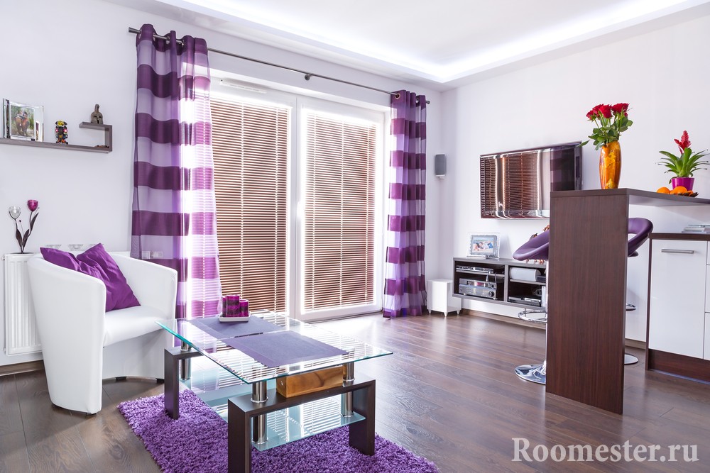
Perfect Matches
The main color of the perfect combination is white, which can eliminate some of the gloom of dark purple. The interior will lose its gloominess, it will become calm, relaxing, as stylish as possible, made with simple materials. Tandem with green is suggested by nature. Floral shades (fuchsia, violet), subtle tenderness of greenery guarantee success.

Fans of calm solutions should refuse to combine it with yellow. Use "powdery" tones (golden, light orange, copper patina). Combinations with light gray, light beige tones are considered neutral. Violet wins against the background of natural wooden surfaces; forged gratings; framed with gilded mirrors. The combination with turquoise looks good, but the intensity of the shades is minimal. Maintaining a balance of saturation and proportions will help to eliminate the risk of fussiness.

Adherents of bold experiments are given the opportunity to create an interior that does not look insipid. Contrast of eggplant, grape, fuchsia with bright open colors (sky blue, cherry), color wall background blue ice will fill the room with the energy of the Brazilian carnival. Catchy, colorful, harmonious: plum, eggplant with canary lemon yellow, emerald.
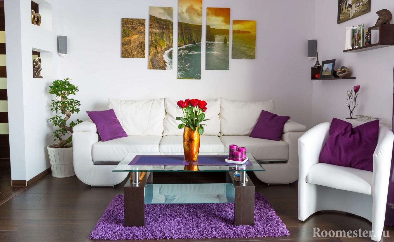
The selected color combinations from the catalog do not always look as good in performance. Take your time, carefully examine the photos of ready-made solutions or use the services of professionals.

- Blue (excess causes depression);
- Red (wrong shades, proportions - a source of discomfort, excessive drama);
- Gray (incorrectly chosen tones will create the effect of negligence, "dirt");
- Black. It is possible to make the Gothic style truly pathetic only with a competent selection of related accessories: candles, paintings, crystal.

How to use?
Color is more diverse than it seems, it has the ability to bring objects closer, to remove objects, to make a bright accent of furnishings. It is not necessarily dark, bright: the use of a muted, light lavender looks gentle, airy, fragile. Monochrome black and white designs look contrasting, but somewhat boring. Alternative: replacing black with plum, white with pale lilac.
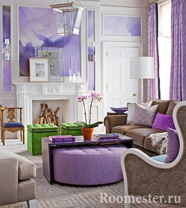
Designers, creating new fashionable interiors, do not limit the use of some standard surface: use is not recommended only for flooring. Walls are easy to make with wallpaper, paint: matte achieves depth, glossy - airiness, subtlety. Wall solutions are often built on the contrasts of various shades of purple. It is performed in geometric patterns, combining rich dark at the bottom to the lightest at the top, creating an unusual gradient. A very pale lilac stretch ceiling completes the design: in the interior of the living room, the technique has found frequent use. A dark blueberry ceiling is a bold decision for a bright room.

Emphasizing purple is a simple, smart move for doubters. Usually a tested scheme is used - the choice of two objects of commensurate volumes: a sofa - a chandelier, an armchair - a floor lamp, a couch - curtains. The solution can be implemented independently, having a standard finish with a neutral base color scheme.

Where to use?
In some rooms it will become a real favorite, in others - an outsider. It is not recommended to use in the office - the effect of weakening attention, concentration. The result will be: not a concentrated work area, but a meditation room. The design of the children's room accepts the palest (lavender, puce, heliotrope) of a small amount, the alternative is one bright detail.

Modern interiors have become often performed in the fusion style, but in a purple living room, a mixture of styles is better to be missed. Loyalty to a particular direction will help to achieve the desired sophistication: baroque, rococo, classicism. The use of only accessory inclusions on a calm background guarantees the absence of fatigue with excessive abundance. Too heavy, thick shades should be avoided. It is better to choose transparent curtains, furniture upholstery - velor, velvet, then the texture of the material will work positively. Flooring - laminate, fashionable smoky gray parquet. Orchid is a current trend filled with fresh flowers and prints. I like bright ones: eggplant, fuchsia, indigo, but lack the courage to experiment - start small: paint the frames of photographs, paintings.

The bedroom, depending on preferences, is created in the spirit of 1001 nights for matrimonial options, choosing the style eastern directions- Arabic, Indian. A selection of delicate shades is a good alternative to the female version of pink. Get an analogue of the romanticism of the pink version, but remove the touch of infantilism. The introduction of only one detail will make the bedroom unusual. Option: standard white bedroom to make a custom-made headboard from MDF, on which, with the help of laser cutting an ornament is made superimposed on a bright substrate - an orchid, magenta, magenta.
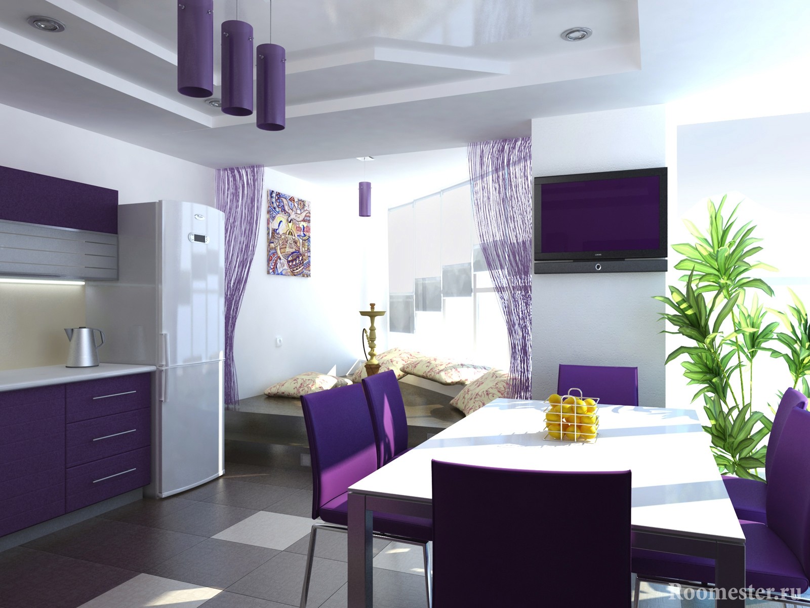
The cuisine uses "edible" variations: eggplant, plum, grape. Partial use is possible: kitchen of the small sizes - facades of furniture. Now many manufacturers offer a wide range of colors for kitchen gadgets, appliances, household items: electric kettles, toasters, dishes. Use a bold design move - a combination with white on one item. White blinds have several bottom slats dyed bright purple; or the legs of the chairs of the white dining area are painted in the same shade as the facades of the kitchen furniture, the apron area.
A bold reception for the bathroom - a game of contrasts. It will not look gloomy, a matte dark wall (blueberry, plum) with a yellow shell against its background will inspire optimism - the sun that has come out from behind the clouds. The technique of painting only one wall is applicable for the hallway area. Interaction with light beige will avoid narrowing the space, installed Entrance door brown, chocolate shade will support the color scheme, emphasize the contrast.

Lighting
Exists general rule: an extremely saturated, dark purple color is selected - lighting is proportionally enhanced, especially local. With the help of a competent selection of fixtures, specialized lighting schemes, a stunning lighting design is created that can change the room dramatically. When choosing warm or cold lighting, use specialized color tables so that the selected shades look the most advantageous. With the same warm lighting, the shades of the predominant red range (pink, eggplant) will win, the cold ones look unnatural (indigo, dark purple).

Applicable to each specific room - certain nuances:
- Living room. The main light source is a chandelier, spotlights with crystalline elements. As an additional - floor lamps. Futuristic, driving exteriors - colored neon will add cosmic notes.
- Bedroom. In addition to the standard set (ceiling chandelier, bedside sconces), it is possible to install colored LEDs. It will allow you to change the color from relaxation, meditation to a hot party.
- Bathroom. Spot lighting will add warmth. Additional lighting behind the mirror, made by LEDs, will not be superfluous.

The benefits of purple
Purple feng shui experts do not disregard. It is believed that colors can fulfill wishes. Precious purple promises wealth, especially in the financial center of the house - the far corner from the entrance on the left side. Color therapists say: it effectively treats cough, neuralgia, helps to gain self-esteem. Or maybe you should listen to the opinion of designers who insist that purple colors in the interior are harmonious, chic and completely luxurious?
![]()
But no one will dispute the assertion that he really has some kind of attractive force that makes you take a chance and find yourself in a purple dream.


